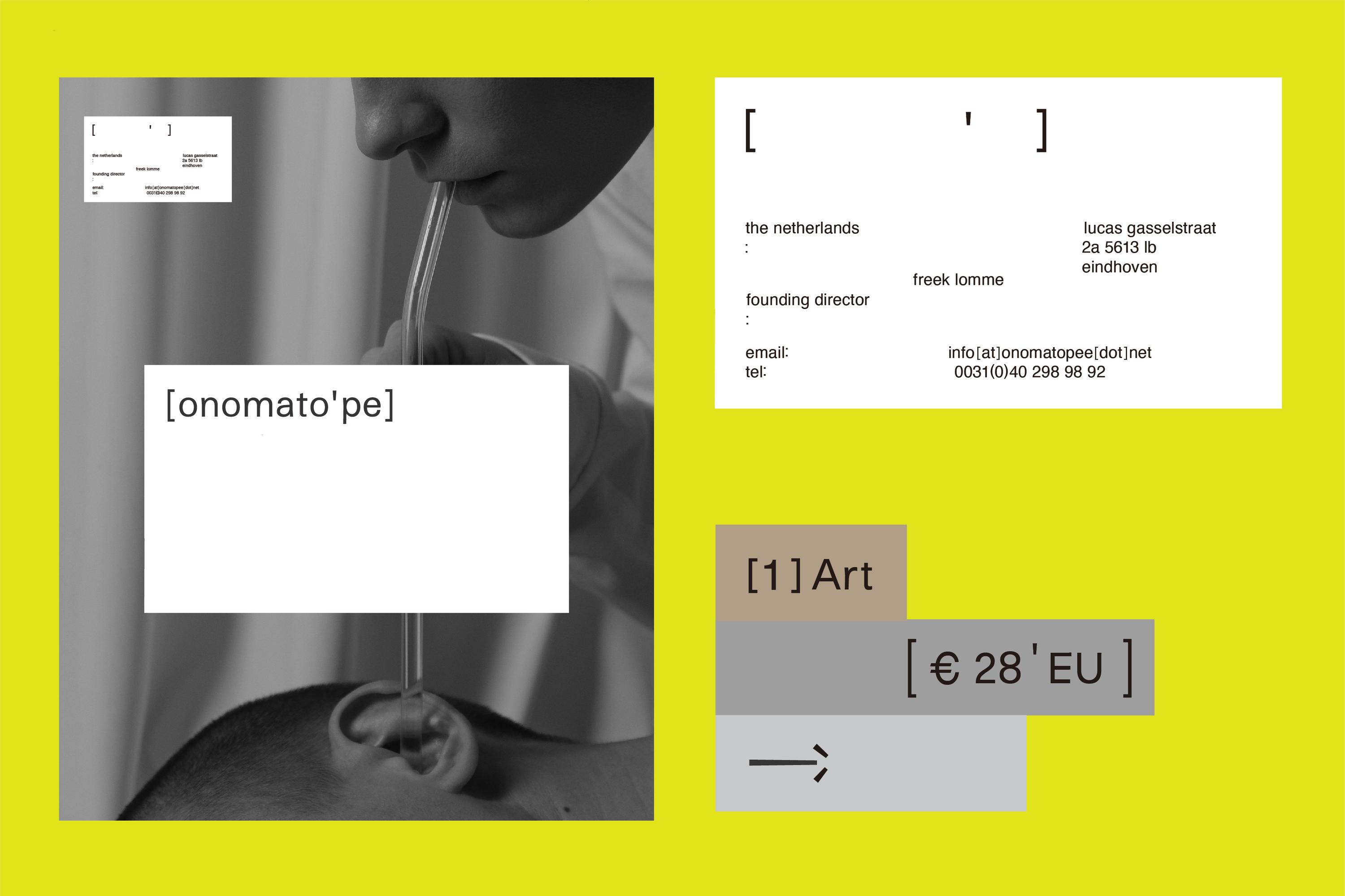
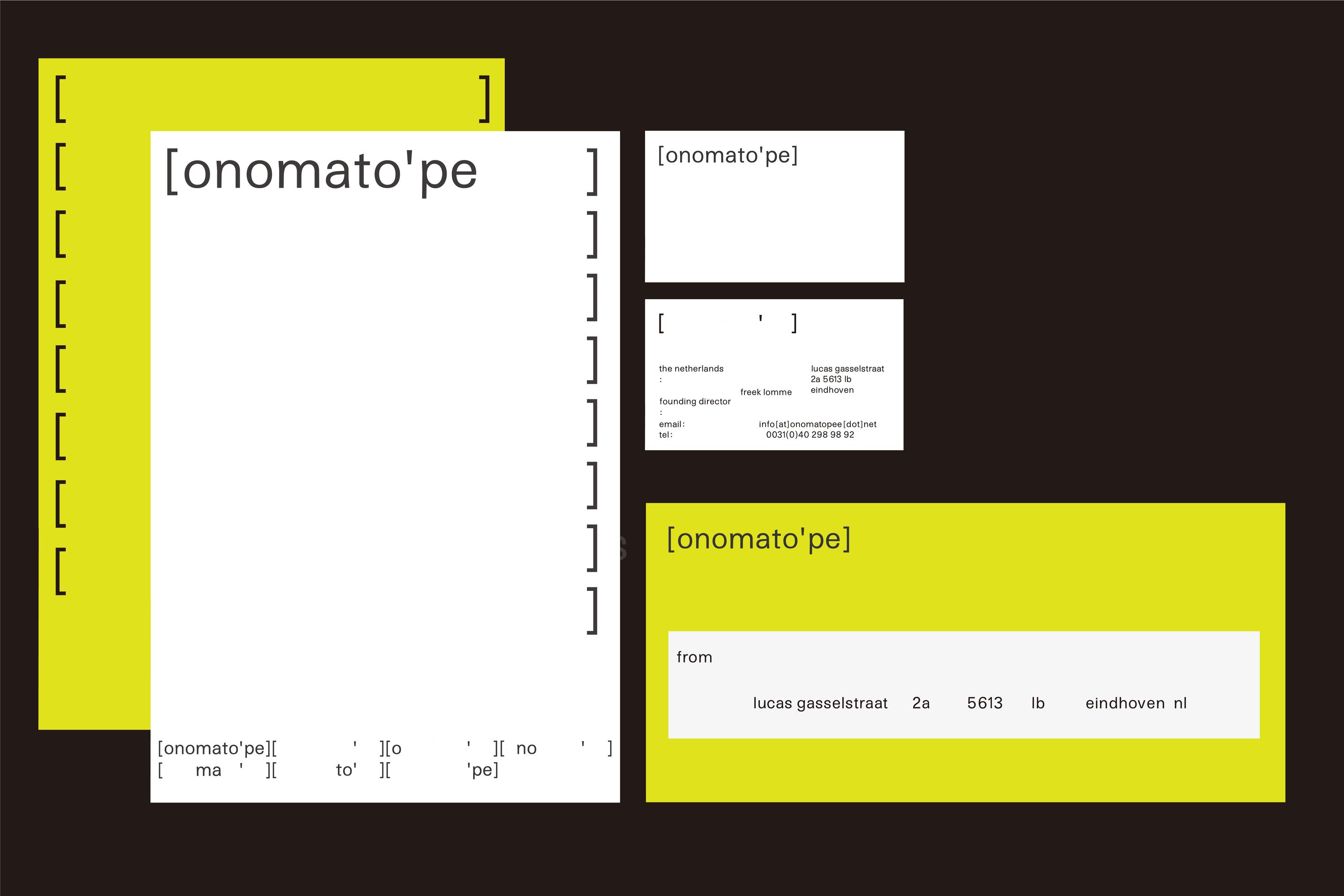
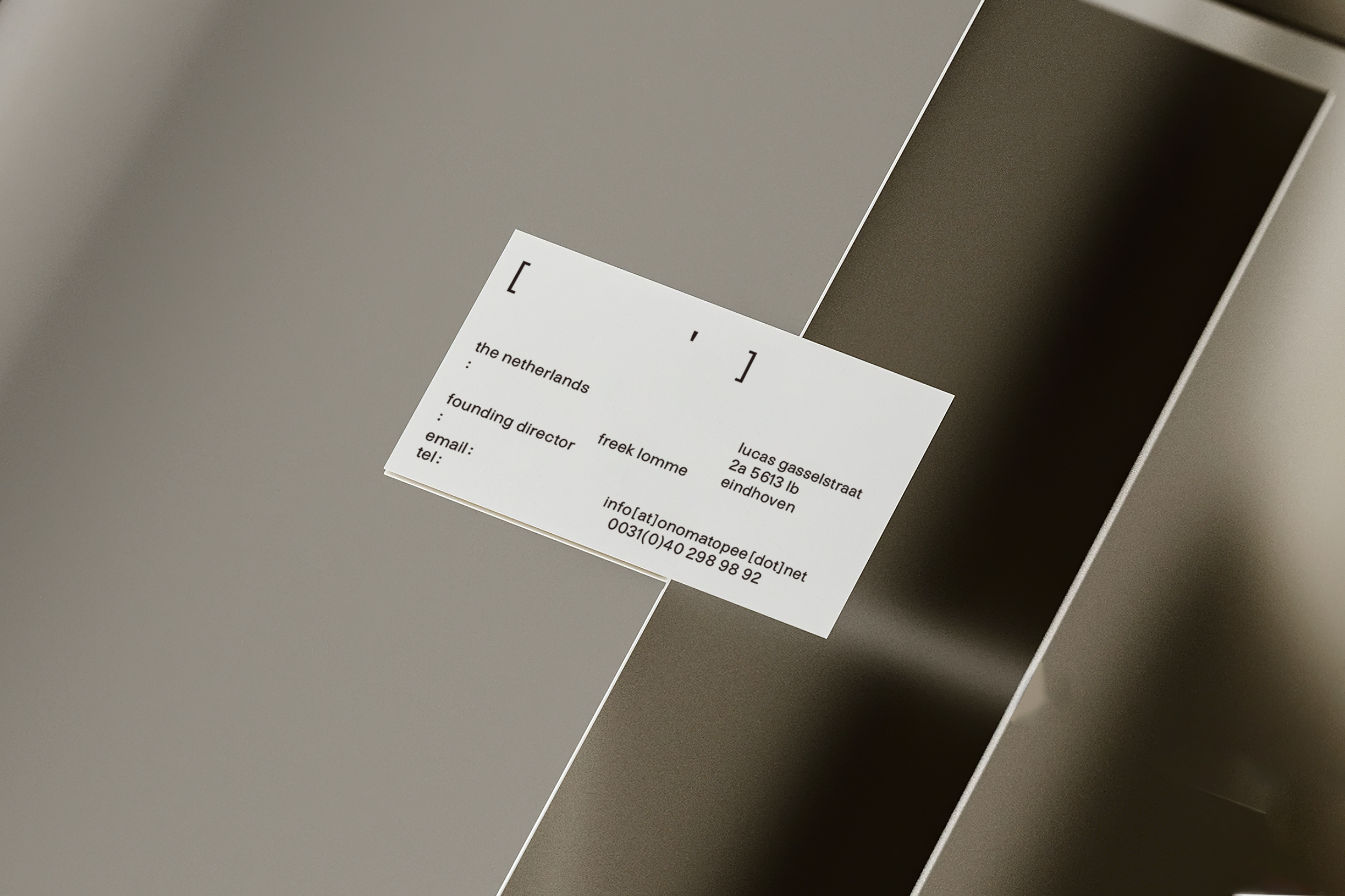
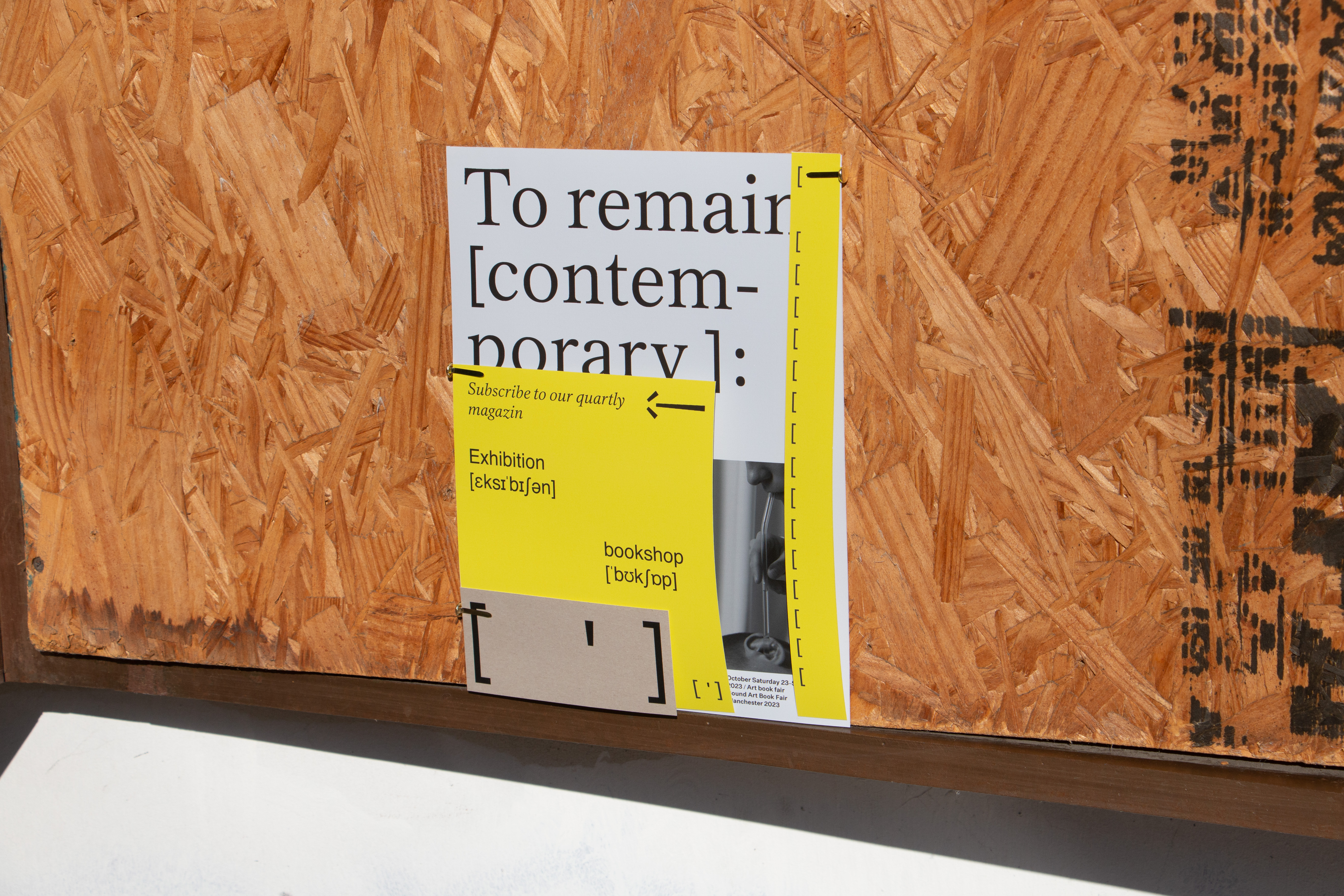
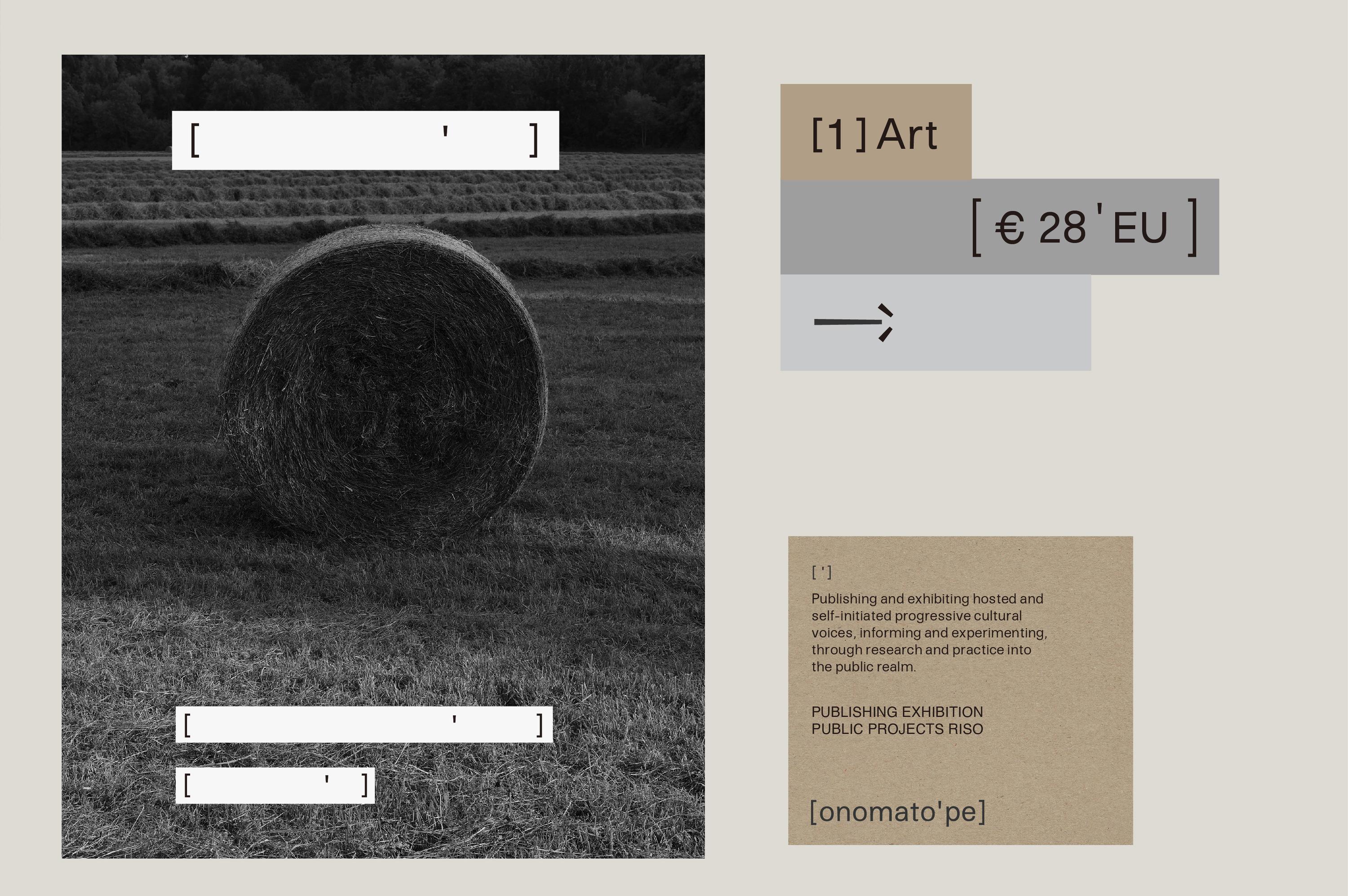
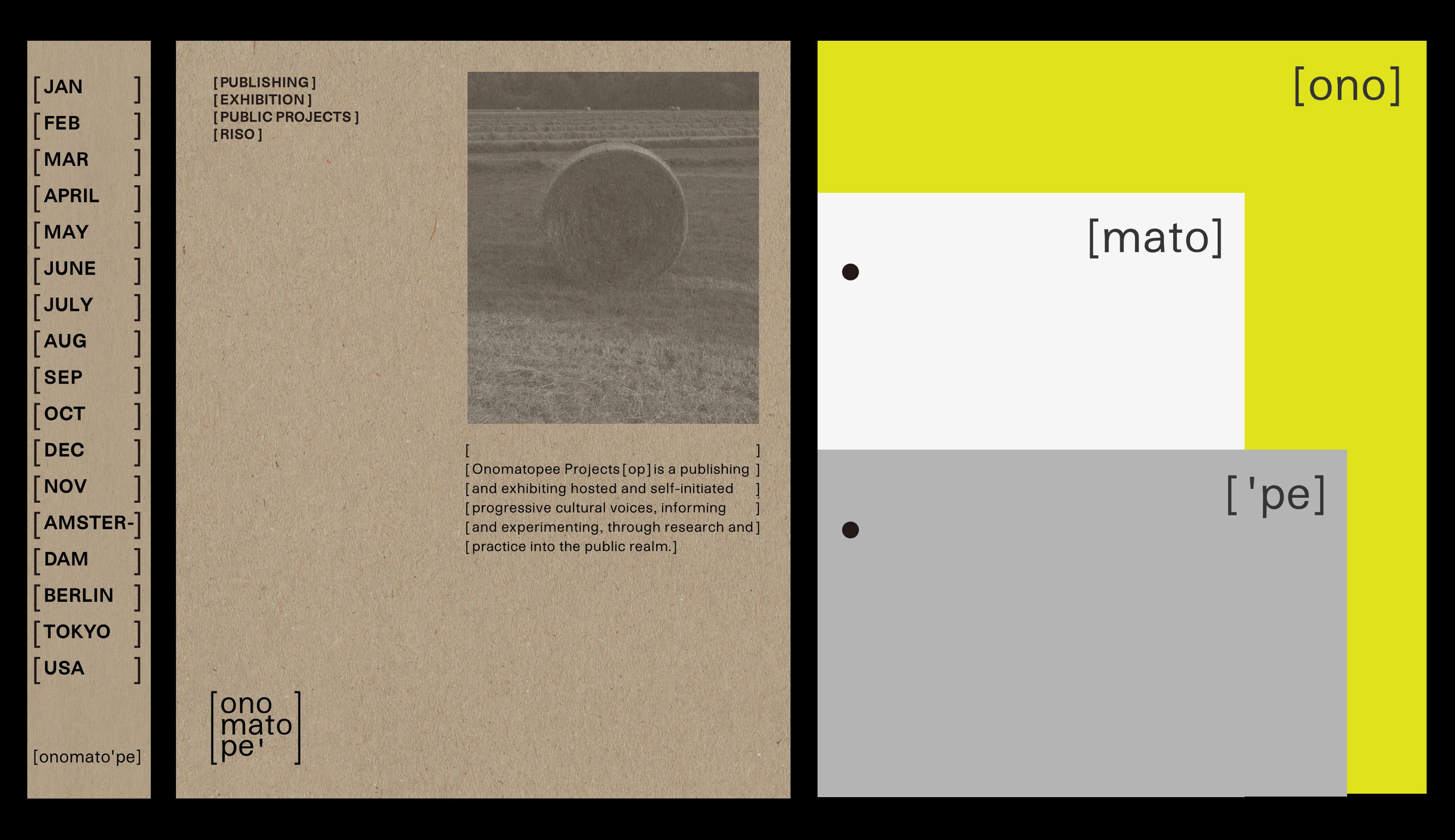
[onomato’pe] ︎ Identity System Design
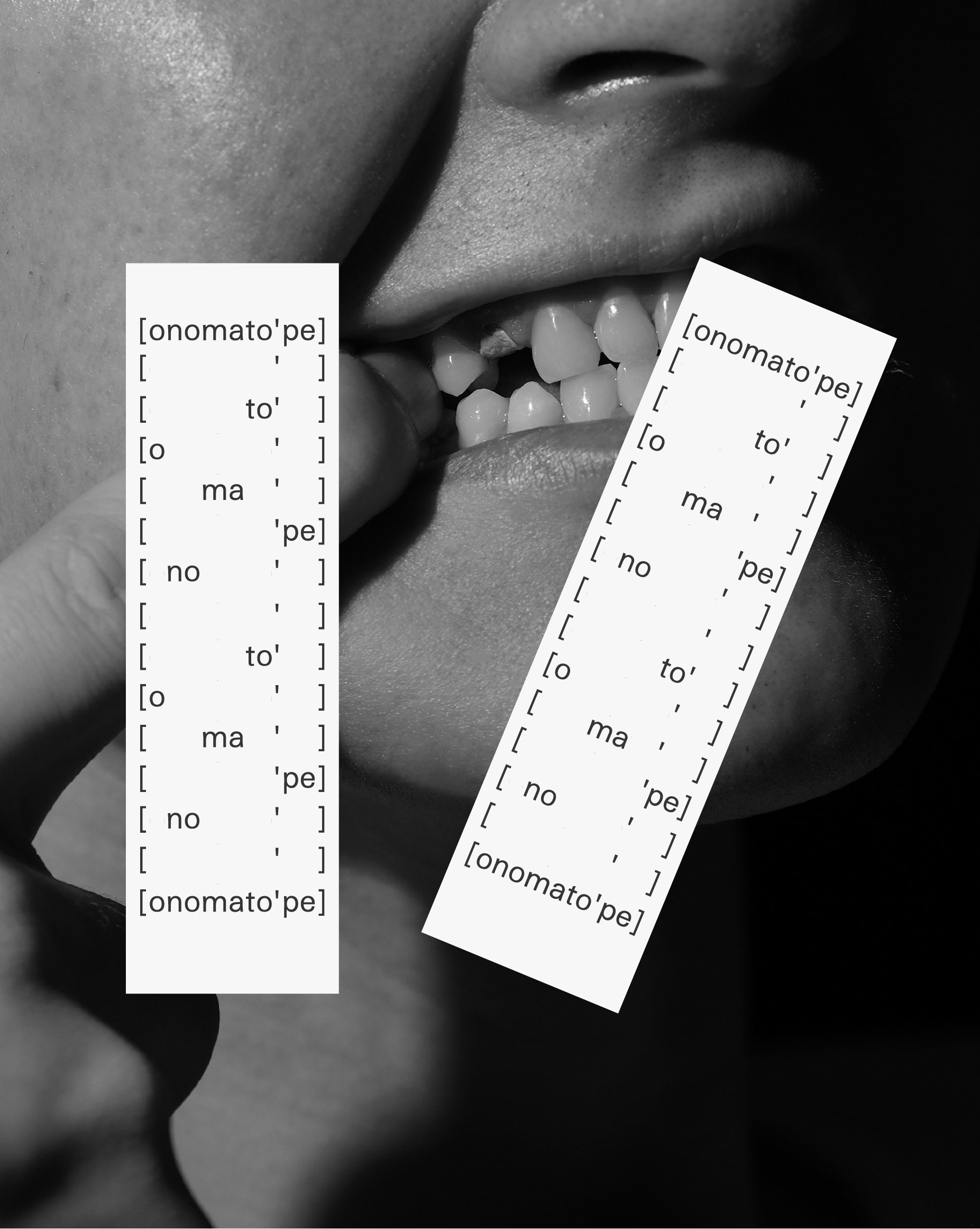
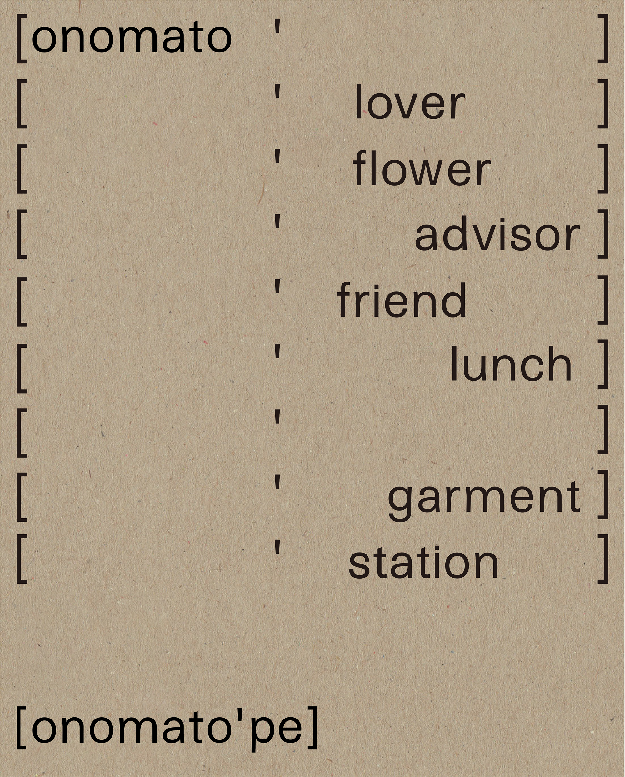
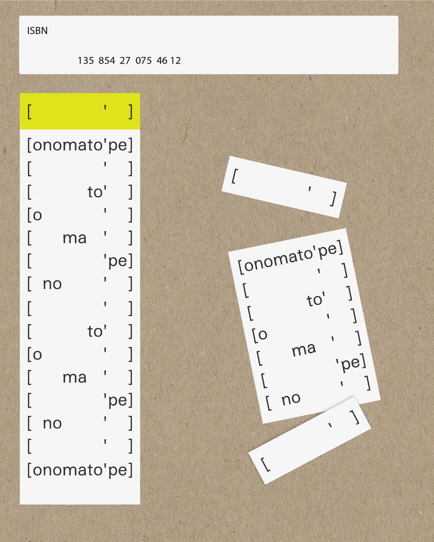
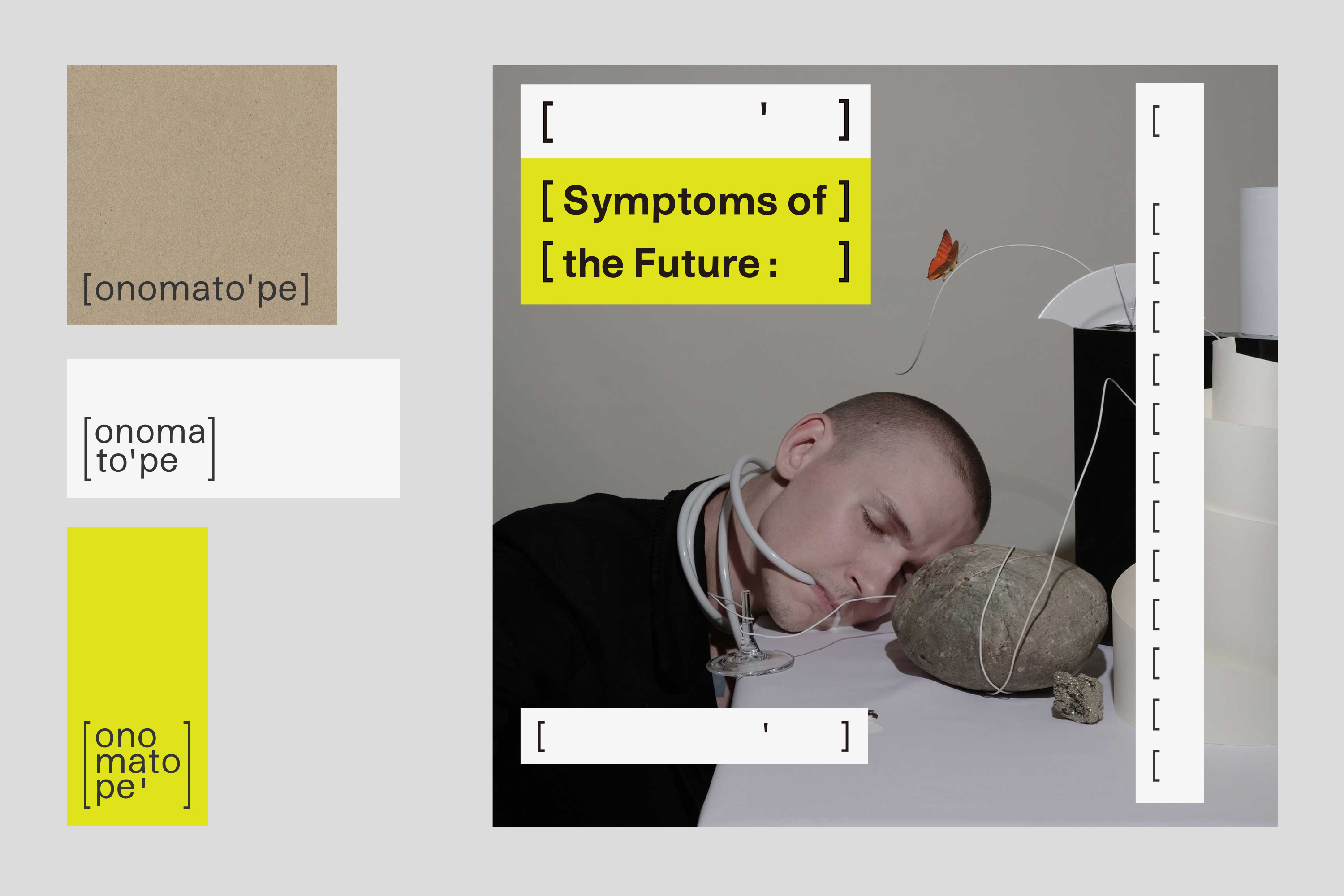
Onomatopee Projects is a curating and editorially led public gallery and publisher that is particularly known for their self-initiated and trans-disciplinary projects. The logo—[onomato'pe] stands for the phonetic alphabet pronunciation for Onomatopee in Dutch language (which means onomatopoeia). The logotype is modified and based on a custom typeface: Casual Grotesque. The Opening legs of the characters give the identity a sense of casualty and warmth. The visual language such as repetition, vanishing and breathable distance for [onomato'pe] is simply inspired by how a word is pronounced and the pauses and stresses in phonetic alphabet. The logotype reacts to different sizes of the collaterals, breaking into different parts of the logo form. The random appearance of each syllable forms the identity of [onomato'pe] naturally.